MARSHALL NUGENT
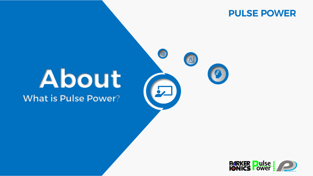
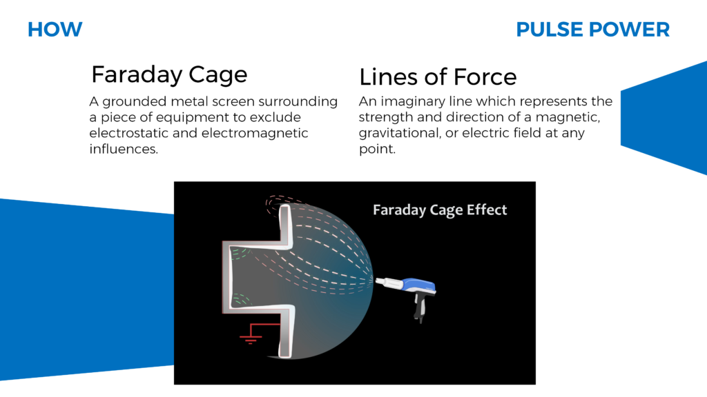
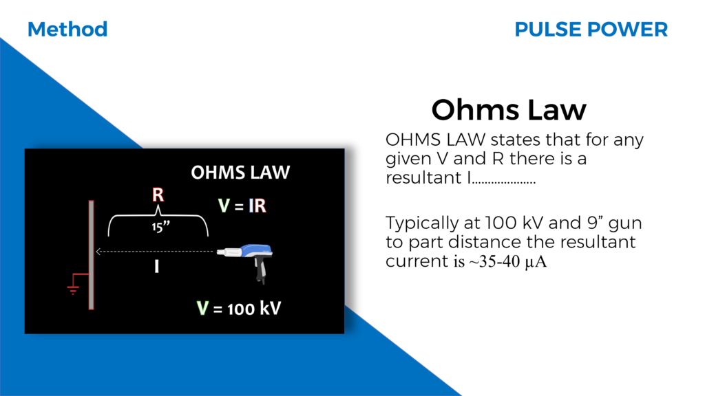
To expand my project and professional experience further, I decided to develop a PowerPoint presentation for Parker Ionics. Knowing the company used PowerPoint for most of their presentations, I decided to use what I researched from their original presentation slides and make my own dynamic version. Going over their slides for the first time, the content was hard for the average customer to understand. To make it easier to digest, the diagrams could be switched out for animated ones that I had already created. Each animation was created in their own pre-composition in After Effects. Precomposing is the process of packaging a series of layers into a new composition in After Effects. By grouping these layers together you can add animation, effects, or masks that will then be applied to all of the layers within[4].This made it easy for me to render each diagram individually and place them into my slides in a universal video format. Much like the transitions you can create in After Effects, you are able to add transitions and animations to individual slides in PowerPoint. While researching new updates to PowerPoint 2020, I came across a tutorial by The Office Lab [5], on how to create a morph animated 3D carousel. The tutorial taught me how the morph function works and an interesting way to layer shapes in a slide to create an interface that has motion. I used this to structure the overall layout and design theme. There are six circles in the carousel, each circle acting as an individual section that the presenter navigates through. The sections are, About, How, Methods, Results, Product, and Conclusion. When navigating through the presentation, the section being presented next will be emphasized with a title and short description. The following slides will be zoomed into using the zoom function in PowerPoint previously stated. After viewing the content within that section, it will zoom out to the carousal that displays the remaining sections to cover.
The design of my presentation required more attention than I had initially planned for. Consistency with the theme, type, grid-layout, and the placement of items were researched to add value to the presentation and optimize the viewing experience. According to the principle of consistency, systems are more usable and learnable when similar parts are expressed in similar ways. Consistency enables people to efficiently transfer knowledge to new contexts, learn new things quickly, and focus attention on the relevant aspects of a task [9]. The placement of elements in a way that controls how the viewer’s eye will move from image to text and travel around a design composition needed to be considered. The type needs to be organized and assigned a hierarchical role, so the viewer is led through a design composition in a way that supports the message’s intent and its ability to be understood. This allows the viewer to take in all of the design’s visual information [7]. To help with readability of my slides, the amount of words per line had to be considered. According to a well-known empirical rule there should be 7 words per line for a text of any length [6]. With these principles in mind, the design became more organized, consistent, and increased readability, and improved the emphasis of the material.
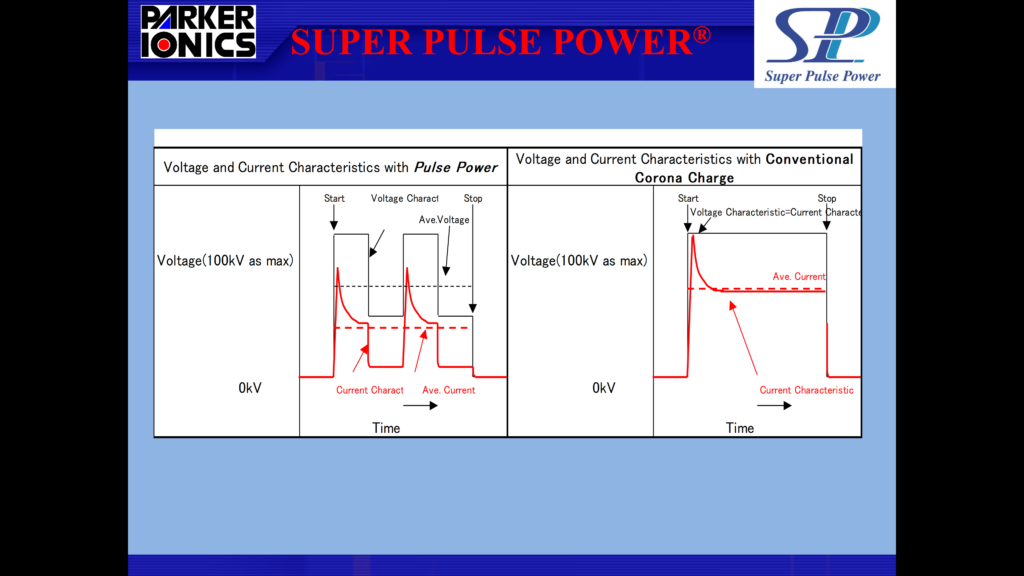
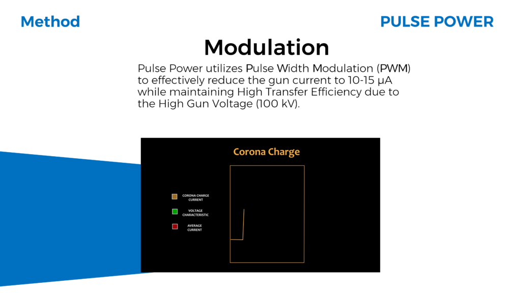
Figure 7 and 8 show a comparison of my design with Parker Ionics. Figure 7 is a slide in the presentation I was given by Parker Ionics to learn what their products were about. Figure 8 is my interpretation of the slide. It includes a description of what Modulation is and an animated video of the graph in figure 7.